Thursday, 17 November 2011

Latex Rock Samples


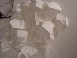
I started experimenting with creating a mould out of paper then painting with the latex. This worked really well, and it was fun so see the changes in colour and texture as the latex dried.


It is a quick technique once it is started, but it does take a while to create the mould to cast the latex onto.


It's hard to keep this technique tidy, but is a lot of fun peeling the latex from the mould. The paper did stick in some places so it wasn't just latex by the end. You also need a lot of layers to make the latex thick enough to have enough strength. The layers do dry quickly though.


1st attempt of putting the latex onto the body. I thought mixing latex and the tyvek together would work, but I don't like the different colours together. The gament also has too much structure, I think there needs to be some loosness and connetion to fabric. Done some research into melted rock and lava, which relates well to the latex samples: creating a solid from a liquid.


I like the idea of the garment flowing, there's movement. The connection between fabric and plastic works well and reminds me of maybe different rock plates meeting, a joining of two very different materials.


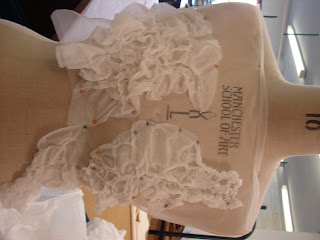
Connecting the fabric with latex again. I created rips and scores in the fabric and pleated where it joined to the latex which manage to mirror eachother more. I also managed to relate the hand processes to this project finally because all the sewing is hand done and I have incorporated drawn threadwork to add texture.


Where the latex and fabric meet. I liked hand sewing this seam because it was quick and created moore interest by being messy. I also like the relationship of colours, they blend well together and bring two very different materials.

Instant Filler Rock Samples


None of the samples I had experimented with had actually had the coled, hard rock surfaces which related so well to rocks. So I started using instant filler which was easy to mould and had a really beautiful surface once dried.


I found it really hard to find a way of connecting all the pieces together without cracking the surface, so I don't think this would be an appropriate material to use to make a wearable object. It's a shame because had the most realistic appearance, but the tyvek and latex samples definately rereate the shape and idea of what I wanted to produce in this project. Plus these samples were really useful as moulds for the atex!

Tyvek Rock Samples


Sample of tyvek which has been heated under the grill. The glue melts and causes the fabric to shrink and bubble up. Once cooled, the glue sets and the fabric becomes hard. This links well to the thes in my project ad enables me to link ideas of shapes I have already come with to fabric and a slightly more conventional material.

Experimenting with a lot of samples on the bdy at once. This is using the tyvek to form a fabric. I like how it is following the shape of the body and is restricted to this, but I think it would be more appropriate to the rock theme if the garment was somehow disrupting or blocking off the shape of a body and forcing the shape of rocks on a person.


Like the idea of small sections of tyvek linked together with a sheer fabric so it is a complete fabric, but at the same time has an edge. I tried this with dissolvable fabric, chiffon and white plastic bags. I think the most successful was the chiffon becasue it want completely see through.


Most recent idea for tyvek. I love the way it resembles a costume, witht the embellishment ontop of a sheer fabric. It seems theatrical but at the same time the chiffon is hard to work with because it frays so easily.


Attempts of adding colour. This is acrylic paint. I think the colour is too strong, and whereas when just left white the small dots of glue add texture; when colour is added, the white dots stay white and make the fabric look less natural. This material is definatley better with no colour added to it.


Photocopying the tyvek samples is really fun. When the light is moving across the fabric, sliding the sample out causes therock to look sticky and molten and viscous. This has moved my project into looking at lava and the other side of rocks deep under the earth. Rocks which move and are almost alive with currents. Moving planes meeting moving planes with violent consequences. It's really exciting.


Tin Foil Rock Samples


This was a spur of the moment idea to use tin foil, and the overall aesthetic appearance of the samples. They have a lot of depth, and are so easy to mould to the exact shape. A lot of difference in scale can be created too with large planes of reflective faces mixed with scrunched up tightly packed facets.


The appearance is very elaborate and beautiful but the problem is the materil is so temporary. You can't transport any section because the flat parts with become scrunched up and its not easy to join together because the foil is delicate. Using foil has been really useful to think abou shapes I want to create. But turning into fabric will be the best idea because it will be the most wearable and the easiest to create into an actual garment.


Attempting to add colour to the foil. I was disappointed to begin with about thelack of colour the foil took, but once it dried I really like the faint hint of colour. The colours are a lot more delicate and pretty rather than brash.


Page from sketchbook. I like how easy the material is ti maipulate onto both the actual body and drawn figures of the body. It is a good tool so start thinking about shape.


1st drawing workshop. 15 drawings in 2 hours, sounds easy but you lose track of time very quickly and the last few end up rushed. The 1st two drawings were of architecture, and the 2nd two hours were drawing from abstract words and sentences. I found the 2nd set of drawings very releasing because I had never heard of drawing from words as being a valid technique and has been a useful technique in this project.


The dog drawing project was ploughing through a number of techniques very quickly. These included negative space drawing, blind drawing, drawing at different speeds and different pressures. This was releasing to do so many drawings so quickly but it would've been nice to have been able to focus and get to grips with a couple of techniques rather than going through so many. 


Thursday, 10 November 2011

Front Cover of A10 Magazine

Taking the same idea I have, but pushing it to the extreme with scale. I love this piece on the wall, it has become part of the wall and seems to grow out of it.

Lucie Hallenstein

This again relates to my folded paper piece and is inspiring me to work bigger. i love how it drapes so that the top looks hard and sculptural and the bottom sways and looks more like fabric.


Matt Shlian

This relates to my 1 metre by 1 metre drawing because of the use of white paper onto a white surface. But these are perfect geometric patterns . I like the use of paper 'reverse appliqué' so is being sculpted into the paper rather than out of it.


Delfina Delettrez

This idea follows the same pattern as my first idea in 3D construct of depicting tendons, and creating a wearable completely relating to the body.

Iris Van Herpen

Escapism

I love how far the sculptural and intricate elements of Van Herpen's work has been stretched. Her work is inspirational to my project because it uses the idea of covering up the shape of some parts of the body and leaves other parts visible or at least highlighted. they also seem stiff, like they are only there to describe the form and to suggest shapes on the body without thinking how these would become practical garments.


Lucas Simoes

Cut-out portraits.

This artist manages to relate my first two workshops together with the use of sharp edges and boxy shapes, and the hand processes technique, reverse appliqué. i love the idea of cutting away and working down to create 3D shapes rather than working up. This could be used well as a drawing technique because it is a bit flatter than the metre by metre drawing I have done yet still has a tactile element and hint of 3D which relates well to my project.
lucas-simoes-cut-out-art

Andreia Chaves

Andreia Chaves

This work has the same ethos as my own project of finding beauty in chaos. I love the intricate design and the natural, organic shape which is created from something to unnatural as a perfect cube.

Alba Prat

I find this work inspirational for this project because Prat is not ashamed to go completely sculptural. It's so different from a body form, yet is completely complementary of it. I am also inspired by the use of such a synthetic material because is is so necessary for the work she is creating and because I am nervous of using it is my own work.

Drawing workshop 10th November

 1 metre by 1 metre drawing before de-construct workshop.
 Staring to scrunch and flatten fabriano so it turns leathery and folding the shapes up further to create smaller shapes.
 Continuing the process with more shapes. I love the contrast of the two. The de-constructed shapes appear darker, even creamy because of the many more shadows and facets created by scrunching.
mixing the two different drawings together to show the difference. The whole drawing has shrunk and become a lot more compact. I like how these so shapes relate to my earlier scribble drawings of force and tension.

Saturday, 5 November 2011

Drawing Workshop Task 2

The purpose of my sketchbooks this term has been to show the journey I have taken my project on. To do this I feel that I have used the sketchbooks in the right way for how I work. They have been a place for new ideas, development and review; rather than somewhere I present all the ideas once they have been realised. Through doing this my skills in experimentation and willingness to push myself have been highlighted. This is especially true in moving away from the small book which I feel comfortable in, to a much larger one.    


 I thought I would get lost on such a large space, but it has pushed me to work bigger to fill the empty page. It also made me work more cleanly and neatly which has always been a challenge for me, but complements my project well.
     When flicking through the sketchbooks, it is easy to see the intent of my project and the direction it is headed. This I feel has been helped by the short amount of time allocated to us to explore our themes - giving me a stronger focus. In the coming weeks I intend to move out of the sketchbooks more. This is not necessarily to work bigger, but to experiment with many differrent scales, relating to my theme of rocks and the vast differences in scale inwhich they occur.
I don't want this to cause large gaps in the sketchbook and the story of the journey so I want to flick between the two different ways of working frequently.
     Most of the work presented in my sketchbooks has been future ideas, and I would like to document more the process I am taking through photography and observational drawing.
This will aid the flow of my thought processes, but also improve my observational skills and force me to be constantly looking back at what I have done and review every sample. Because of this constant look to the future, there are large jumps in my sketchbooks where I have suddenly changed course, and I intend to go back and smooth them over to explain the reasons behind the seemingly erratic jump into different ideas.
     To some extent, a certain 'style' of working has come through so far in the sketchbooks, but i would like to wok on this further. It is important for me to start focusing on skills I have which are standing out and something which unique to my personal work.